Every lolita fashion season ever: XXX Brand's newest print! Available in Pink, Sax, White, and Black.
YYY Brand's newest print! Available in Pink, Sax, White, and Black.
ZZZ Brand's newest print! Available in Pink-- you get the picture.
Though all dresses are different and appeal to different people, the truth of the matter is brands often repeat the same colour schemes over and over in their designs. It's not a bad thing- they are popular colour ways and appeal to many people. But today, I'd like to talk about the most underrated colours in Lolita fashion- the ones that rarely pop up in catalogs, but none the less have an elegant appeal to them.
The first colour I'd like to bring out of the closet is Grey.
It's cool, reserved, and contrasts nicely with black or white. It also makes an adorable tartan, twill or pinstriped textile. Accessories with hints of red or gold match very nicely.
 |
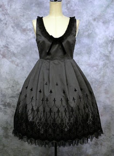
| A Moi-Meme-Moitie Jsk, with black tulle and flocking for contrast |
 |
| A Flasco coordinate, most likely Miho Matsuda or Excentrique. The grey pinstriped suit looks smart with a contrasting black blouse and bright silver buttons. |
 |
| Metamorphose's "Sherlock" Jsk set, sold with complimenting black items and pearl accessories. Though shown as a set coordinate here, the neutral grey tartan is quite versatile. |
The next underrated colour is one of my favourites- Blue!
All through my lolita "life", I had experimented with lighter hues of pink, cream, lavender... and wasn't fully satisfied with how it looked on my skin tone. But last year, I started trying on deeper colours like Navy blue, and it balanced out the red in my skin tone nicely.
Blue looks nice with almost any colour, especially gold, red, or green. I think it is classic and maidenly, but also strong, and almost regal. It looks nice as cotton, but even more majestic in rich textiles like velvet or taffeta.
 |
| Metamorphose's "Pintuck Jsk" looks perfect in this deep navy. |
 |
| Atelier Pierrot's deeper indigo dress, contrasted with black, white, and sax blue accessories. |
 |
| This dress by Victorian Maiden is in a lighter navy colour. It would be nicely complimented by rose pink accessories for a warmer spring look. |
The next colour is Green. I like it for mostly the same reasons I love blue. It comes in many shades, from warm sage to deep emerald. It can be a light spring hue or a deep ivy. Even though it's more reserved than red, or pink, I think it's shyness is its strong point.
 |
| A velvet jumperskirt with gold embroidery, by Moi-Meme-Moitie. |
 |
| Metamorphose's "Dolly crown" velvet Jsk, with embroidery and pearl accents. |
 |
| A warmer sage dress by Juliette et Justine, with a matching top hat in deep green. |
The last colour I'd like to praise is Rose Pink. Normally, I don't like pink at all, unless it is this specific shade of pink. I've heard it called "dusty" pink before, but I feel that name doesn't do it much justice.
It is such a delicate pink, it is almost neutral, which is why it goes well with a surprising range of colours. I especially like it with black, brown, or burgundy.
Since it is such an unassuming colour, but kicks up the intensity of other colours, I think Rose Pink is the most underrated colour!
 |
| A Flasco coordinate. I believe the bolero is by Innocent World. |
 |
| The rose pink blouse transforms the look of this gothic Atelier Pierrot Jsk. |
 |
| Rose pink ties in the colours of the rose corsages, once again transforming the outfit. It makes the "gothic" Atelier Pierrot skirt look demure and Springy. |
I hope you enjoyed my post, and maybe will be inspired to try these new colours in your wardrobe someday.
Dare to venture around the colour wheel? Let's see what other lolitas are saying about this week's topic! Let's take a look under the big top~


